How to visualise servo behaviour#
Visualise the relationship between pulse-widths and angles#
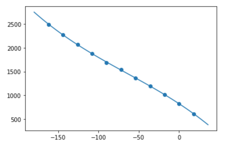
A Jupyter Notebook is included, to help visualise the relationship between pulse-widths and angles, using the same numpy.polyfit() as used in the BrachioGraph:
To run the Notebook, you’ll first need to install Jupyter Lab (it’s not included in the
provided requirements.txt) with:
pip install jupyterlab
Then launch it with:
jupyter lab pulse_widths.ipynb
The values used in the Notebook are exactly as provided for servo_1_angle_pws and servo_2_angle_pws in an
actual BrachioGraph definition, for example:
servo_angle_pws = [
    [-162, 2490],
    [-144, 2270],
    [-126, 2070],
    [-108, 1880],
    [ -90, 1680],
    [ -72, 1540],
    [ -54, 1360],
    [ -36, 1190],
    [ -18, 1020],
    [   0,  830],
    [  18,  610],
]